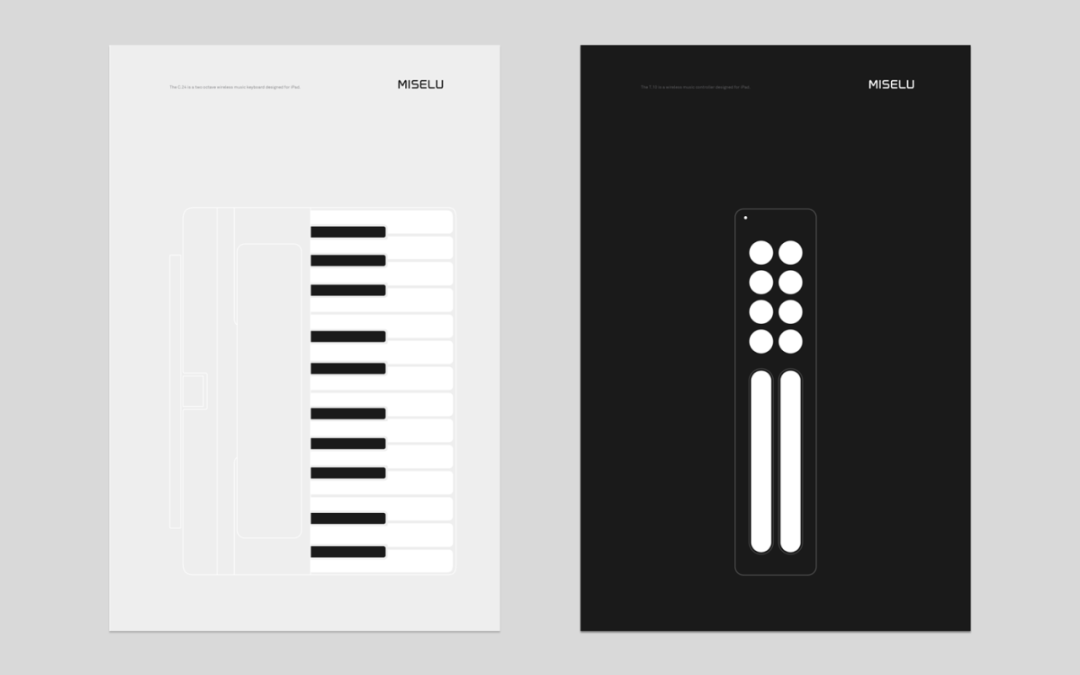
This site follows a minimalist design, using black, white, gray, and blue as its core colors. Black and white create strong contrast; gray softens the transition; blue highlights key interactions like links and buttons—keeping the visual experience clean and focused, inspired by Apple’s aesthetic.
Generous whitespace and unified sans-serif typography ensure clarity and comfort. Interface elements are minimal, shown only when essential to reduce distractions.

To enhance simplicity and efficiency , disabling the table of contents and search functions is recommended:
params:
    toc: false
    fastsearch: true
This site values “less but better,” removing the unnecessary while keeping the essential—a principle that will guide its future design.